

The COVID-19 pandemic has done more than change consumer habits; it has resulted in a mass migration out of urban centers across the country. Using our Foot Traffic data*, we analyzed migration patterns in and out of cities before and during the pandemic to understand just how this exodus occurred.
Our methodology looks at particular urban cohorts** pre-pandemic, and analyzes what share of each cohort moved out, to what destination, and how many have returned. We replicate this analysis in the prior year (i.e. cohorts from before March 2019) in order to establish and compare this year’s COVID-driven migration to a benchmark of “normal” migration patterns exhibited in the data. We believe that the difference between this year’s and last year’s migration is the appropriate way to measure any COVID-driven changes, and is the methodology we employ throughout the analysis. For further reference on how these metrics were calculated, we’ve added an addendum at the end of this piece to aid in the understanding of our methodology.
Key Takeaways
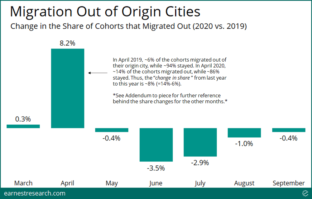
Mass Exodus, then Halt
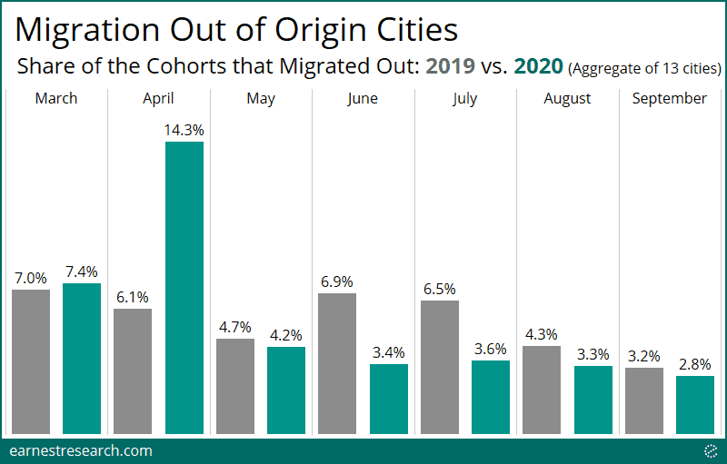
For a broad measure of national urban migration, we looked at an aggregate of thirteen large cities (depicted below) and found that the share of people that moved out of their origin city was ~8 points higher during the initial April pandemic hit, relative to the share of urban outflows seen in the same period last year. This exodus then halted in May, likely impacted by mandatory stay-at-home orders across the country, leading to a ~3 to 4 point share decline in outflows during the typically high movement summer months of June and July. By September, outflows appear to have returned to normal.
By City
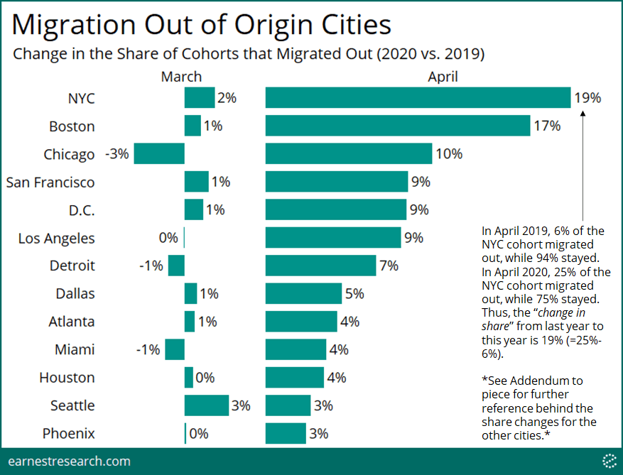
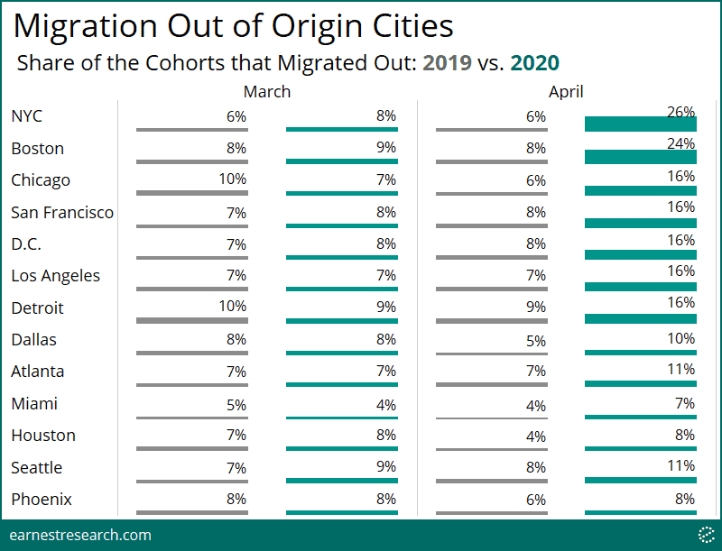
NYC and Boston saw the sharpest exodus during the height of the pandemic, with ~20% more outflows relative to last year. Chicago, San Francisco, and D.C. saw a meaningful ~10% increase. Phoenix and Seattle saw the least, at under 4%. Several reasons account for this, such as population infection rates, severity of lockdown measures, and weather, amongst other factors.
We note that already in March, Seattle saw slightly higher outflows relative to its peers, perhaps related to the early reported cases there. It is interesting that Seattle did not continue to see a sharp increase in April.
Homecoming?
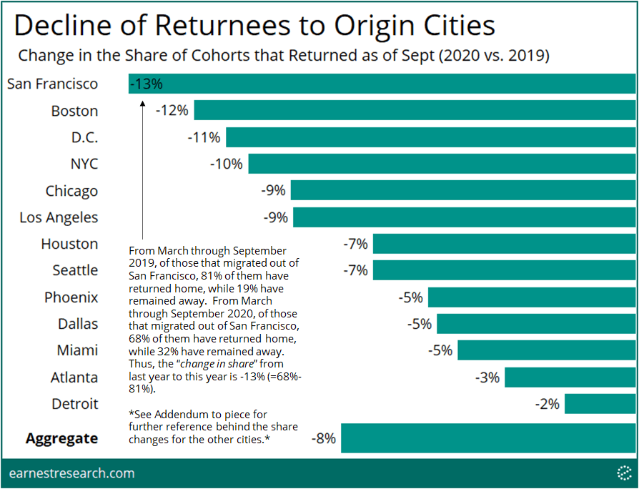
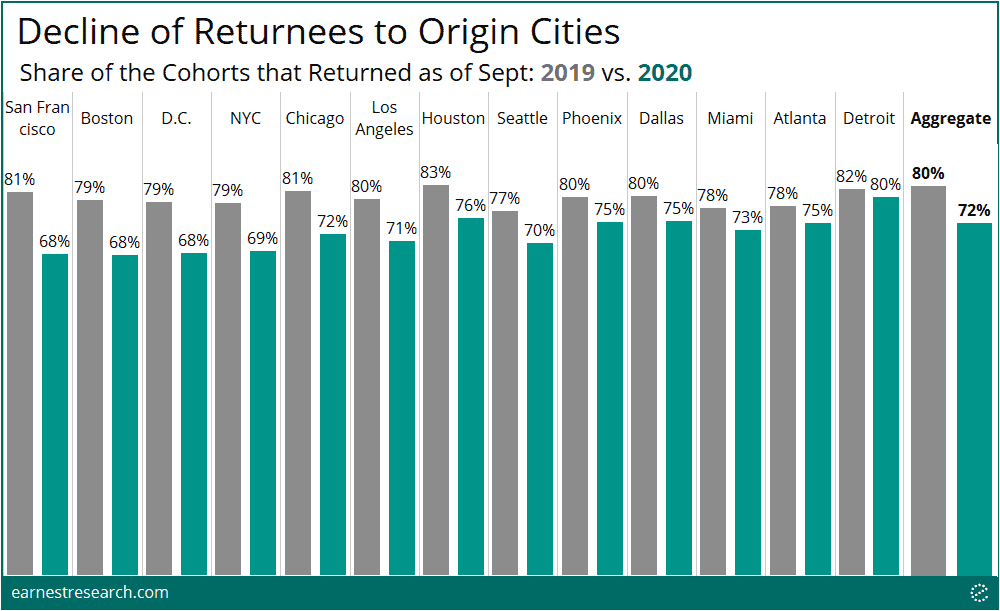
The big question is if the mass exodus seen in April was just a temporary escape—or was it the start of a long term shift in the residential makeup of the country? To address this, we analyzed whether the share of the cohort that returned home after migrating increased or decreased relative to the share of those that migrated and returned home last year.
As anticipated, the share of those that returned home this year declined in all of the thirteen cities analyzed, resulting in an aggregate decline of 8% through September. Cities that saw the sharpest exodus generally also saw the sharpest decline of returnees, implying that at least as of September, many of those that left these cities have stayed away. San Francisco is an interesting case as it saw the sharpest decline in returnees (-13%) but was (only) number four on the exodus list (+9%). On the flip side, NYC saw the sharpest exodus (+19%), but is (only) number four on the least-returned list (-10%), implying more people have returned to NYC relative to SF.
Destinations
*Bubble scale adjusted to enhance visibility of migration
Where did the cohorts that moved, and not (yet) return, go? The answer to this question can be understood in two different ‘destination-buckets’: 1) neighboring cities and 2) distant cities.
Focusing on the NYC-area cohorts, the data shows that the vast majority of movement was to the first destination-bucket: neighboring cities. We note that while this is indeed representative of some city dwellers moving outside the city-center due to the pandemic, it is also very likely a reflection of commuters no longer commuting to an office (versus an actual change of one’s home city). Nevertheless, we illustrate below how this ‘bucket-1’ movement has materially shaken up the NY-NJ Core Based Statistical Area (CBSA) composition of destination traffic.
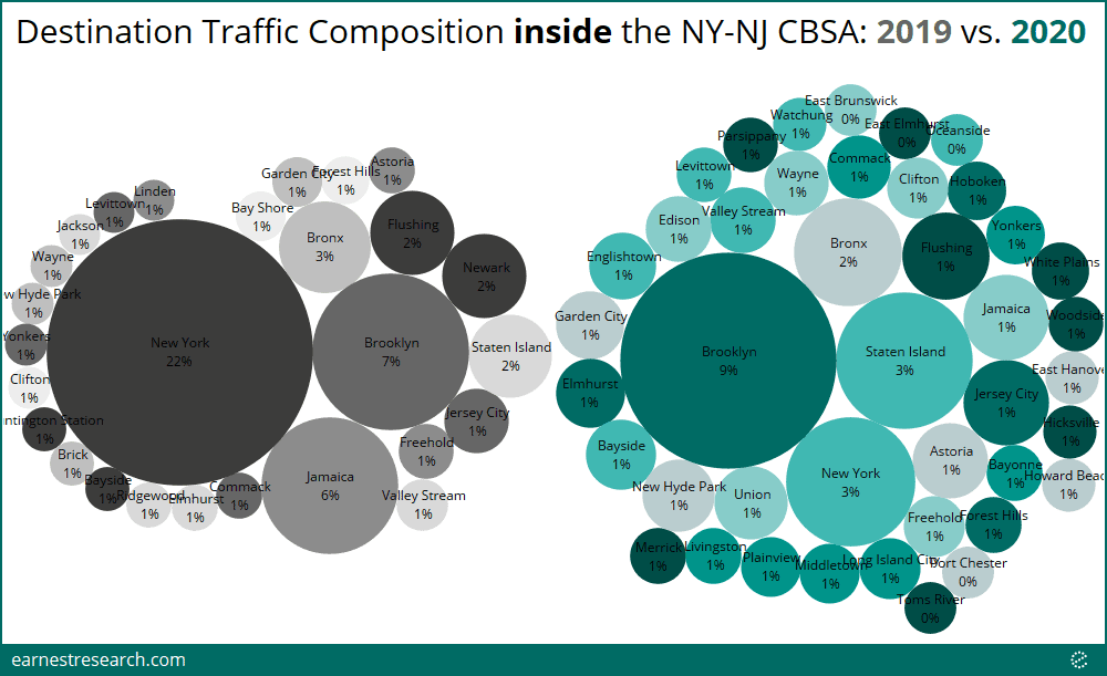
*Limited to NYC-area cohorts that ‘moved’ (i.e. saw their origin city change for the majority of a month) in each respective year. Limited to NYC-area cohorts that did not (yet) return to their origin city in 2020; a limitation not applied to 2019 as that would exclude general travel in 2019. Excludes a long tail of cities that account for less than half a percent of total traffic in each respective year (thus percentages displayed do not add to 100%). Data is from March to September in each respective year.
The tail of the cohort that moved to distant cities (‘bucket-2’), the traffic composition to various destination states changed in interesting ways as well. Movement in 2019 reflected more typical travel destinations, with distant states such as Florida representing 38% of destination traffic, California with 5%, and Nevada with 4%; all alongside travel to neighboring states as well. However, in 2020, these neighboring states took over to a large degree: Connecticut accounted for 15% of traffic, New York (outside the city) with 13%, and Pennsylvania with 12%. Although far lower than 2019, Florida-as-a-destination still achieved the 3rd highest mark, with 13% of destination traffic for this NYC-area cohort.
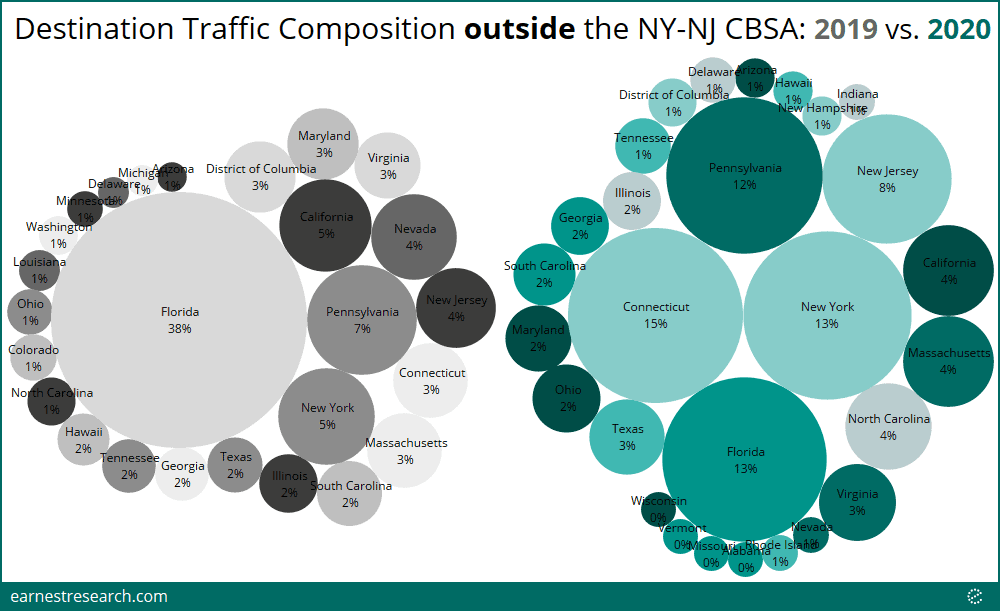
*Limited to NYC-area cohorts that ‘moved’ (i.e. saw their origin city change for the majority of a month) in each respective year. Limited to NYC-area cohorts that did not [yet] return to their origin city in 2020; a limitation not applied to 2019 as that would exclude general travel in 2019. Excludes states that account for less than half a percent of total traffic in each respective year (thus percentages displayed do not add to 100%). Data is from March to September in each respective year.
Notes
The nature of this published piece does not allow for an exhaustive analysis on every city across the country. Please reach out if you are interested in a similar but varying cut of this analysis.
*The data in this analysis is limited to the 650,000+ retail and business establishments that are mapped as part of the core dataset received from our partners. It importantly does not include any private or residential locations.
**Cohorts are defined by the city in which the majority of a consumer’s visits occurred in the 14 months trailing February 2020; with the majority city ascertained via quarterly aggregations in 2019 and monthly aggregations in 2020. (The prior year benchmark is defined the same way just in the preceding 12 months). If the majority city changes in a particular month, the resident is considered to have ‘moved’ in that month. We recognize there are various reasons, other than the actual moving of one’s residence, for why the majority of visits could occur in one’s non-resident city. This is a core reason why our analysis focuses on the difference between this year’s migration statistics and last year’s as the benchmark, rather than focusing simply on the nominal percentage of outflows of a given cohort this year.
Addendum on Methodology
As referenced in the chart captions above, below depicts the actual share of the cohorts that migrated out, as well as the actual share of returnees, for all the other months and cities. As noted, the delta between these 2020 and 2019 values (i.e. the share change) is what is depicted in the graphs above.
Addendum to Chart 1
Addendum to Chart 2
The calculated delta may not exactly tie due to rounding.
Addendum to Chart 3
The calculated delta may not exactly tie due to rounding.
To learn more about the data behind this article and what Earnest Research has to offer, visit https://www.earnestresearch.com/.


Sign up to receive our stories in your inbox.
Data is changing the speed of business. Investors, Corporations, and Governments are buying new, differentiated data to gain visibility make better decisions. Don't fall behind. Let us help.


Sign up to receive our stories in your inbox.
Data is changing the speed of business. Investors, Corporations, and Governments are buying new, differentiated data to gain visibility make better decisions. Don't fall behind. Let us help.