It’s been a sobering week, to say the least, on a number of fronts. At the same time that daily COVID cases reached record levels nationally, driven mostly by states that opened up aggressively and disregarded health protocols, unemployment claims also came in higher than expected. The grim combination made it abundantly clear that the recovery will not be swift – a realization that was clearly news to the markets which plummeted precipitously late in the week.
Lest anyone lose sight of the hole we are in as an economy (not to mention as a country), it’s worth revisiting CalculatedRisk’s Scariest Chart ever.
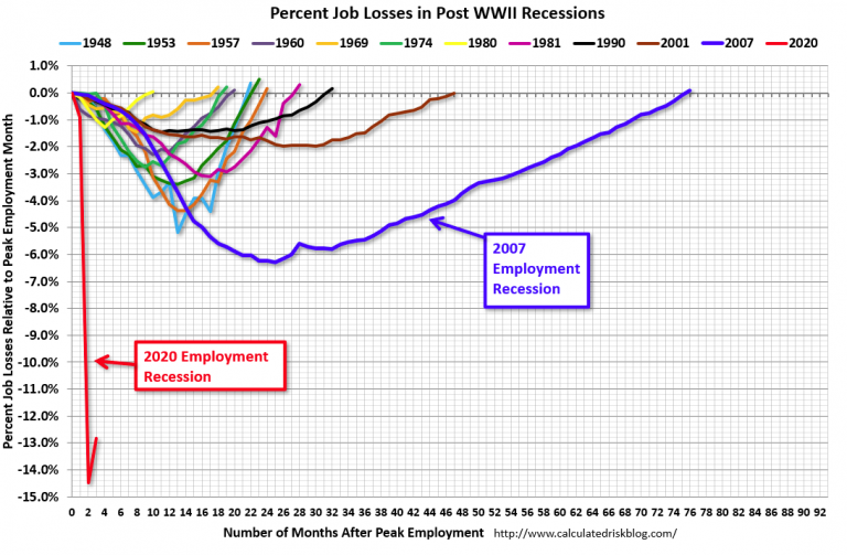
Needless to say, we have a long road in front of us and can expect to ride along the bottom we hit in early May for quite some time.
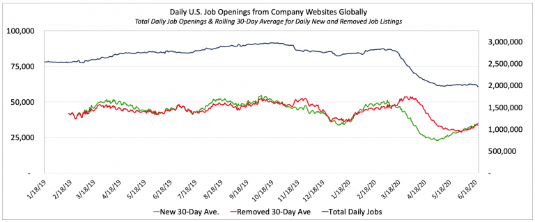
That bottom is perfectly evident in the chart below of The LinkUp 10,000 that measures daily the total job openings on the company websites of the 10,000 global employers with the most job openings in the U.S.
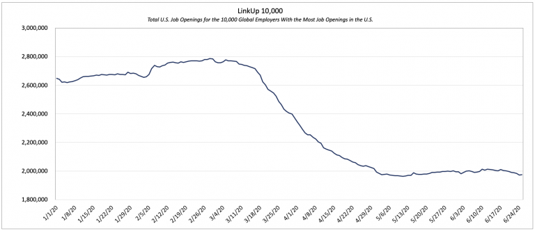
While The LinkUp 10,000 has risen ever so slightly since bottoming out in early May, it is essentially flat and the daily change, as evidenced below, is pretty consistently straddling zero.

What has returned to ‘normal’ in the U.S labor market is the fact that the trailing 30-day average of daily new and removed job listings on company websites throughout the country are now back in tandem with one another. And while the daily number of active job openings isn’t rising, new and removed jobs have risen steadily since May which provides some evidence that some portion of businesses have started or intend to start hiring again.
Unfortunately, while the worst of the initial shock wave might be behind us (maybe), the aftershocks will likely continue for some time as states open up, COVID-19 cases rise, and states subsequently lock things down again (i.e., Texas). Lurking underneath that surface-level rippling are the far more significant factors relating to mass layoffs, bankruptcies, delinquencies, and defaults that are most certainly on the horizon, followed by the permanent demand destruction and societal change that will inevitably result from the pandemic.
And because It’s exceedingly difficult to handicap the probability, breadth, and magnitude of the latter two, we’ll stick to the surface ripples we’re seeing in our data.
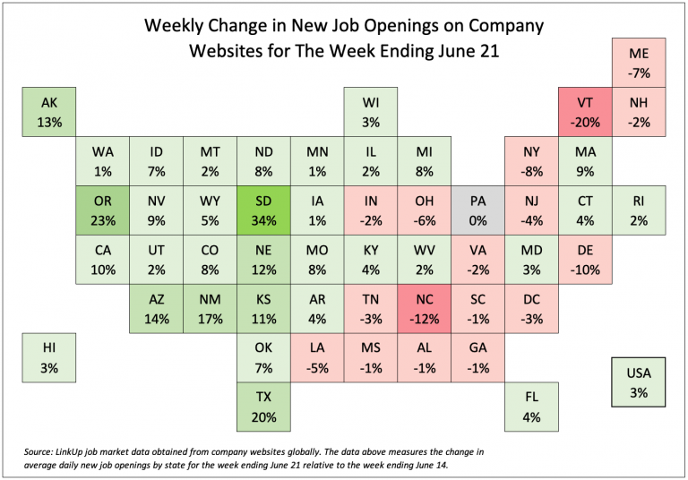
In looking at average daily new job openings for the week ending June 21, about a third of the country saw a decline in new job postings relative to the prior week.
That contrasts sharply with a chart we published about a month ago that showed a dramatic increase in new job openings across essentially the entire country.
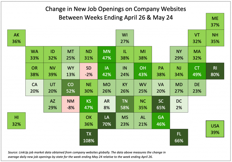
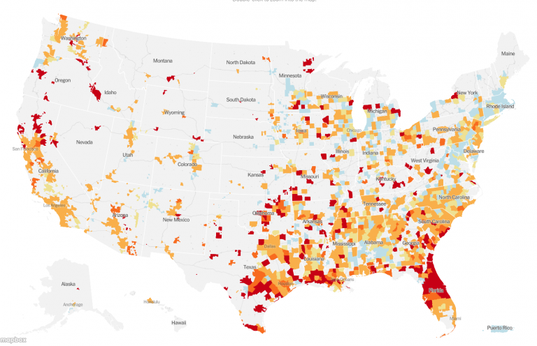
Of particular note in the chart above are the states with the most significant increase in new job openings – Texas, Louisiana, South Carolina, and Florida. Not surprisingly, a month later, those are the states that are now seeing the sharpest increases in COVID-19 cases as evidenced by the NYT map below.
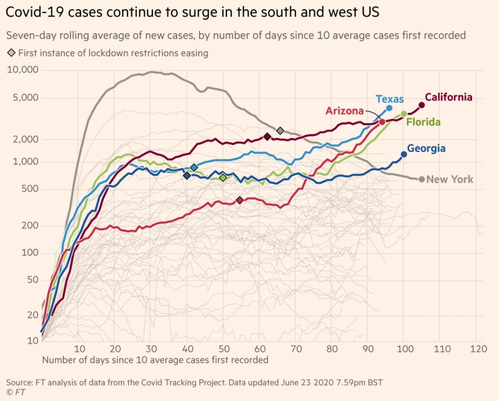
While the Financial Times presents similar data in a different way, the chart below tells basically the same story.
Using a similar approach, we’ve mapped the weekly percentage change in new job openings for each state – a graphic that highlights yet again why Florida and Texas are now seeing record COVID-19 cases (see May 17 below).
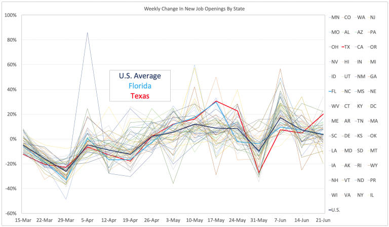
Unfortunately, the chart above also highlights the incompetence insanity of the federal response to the pandemic.
As I said at the outset, we’re in for a long slog.
To learn more about the data behind this article and what LinkUp has to offer, visit https://www.linkup.com/data/.


Sign up to receive our stories in your inbox.
Data is changing the speed of business. Investors, Corporations, and Governments are buying new, differentiated data to gain visibility make better decisions. Don't fall behind. Let us help.


Sign up to receive our stories in your inbox.
Data is changing the speed of business. Investors, Corporations, and Governments are buying new, differentiated data to gain visibility make better decisions. Don't fall behind. Let us help.