Huq has mapped the density of people within London by postcode district, month-on-month since the start of the year to create a time-lapse revealing emerging patterns. The visualisation shows how lockdowns one and two have transformed the capital, and what activity looks like across the city today. Darker shading on the map represents a higher population density.
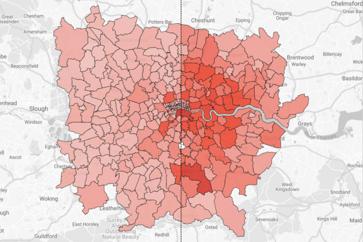
Some of the key takeaways include:
To learn more about the data behind this article and what Huq has to offer, visit https://huq.io/.


Sign up to receive our stories in your inbox.
Data is changing the speed of business. Investors, Corporations, and Governments are buying new, differentiated data to gain visibility make better decisions. Don't fall behind. Let us help.


Sign up to receive our stories in your inbox.
Data is changing the speed of business. Investors, Corporations, and Governments are buying new, differentiated data to gain visibility make better decisions. Don't fall behind. Let us help.
