In recent weeks, the term “K-shaped recovery” has been popping up with increased frequency; used by political figures, economists and media personalities alike. Investopedia, in short, defines a K-shaped recovery as when “different parts of the economy recover at different rates, times, or magnitudes.”
There already has been a fair amount of analysis done on this to support the claim that the recovery from the coronavirus pandemic is K-shaped. Our current analysis finds two groups being affected by this: the wealthy who are recovering faster in a V-shaped pattern, and the less fortunate who are largely not recovering at all, forming a straight line pattern.
Substantial analysis on how this is being seen in the economy already exists. For example, Fast Company points out “While the financial markets recover and grow, the real economy, or the flow of goods and services, gets worse. That’s worrying, because 84% of the stock market is owned by 10% of households.” This analysis suggests that a mere 10% of wealthy households are receiving the benefit of a market running hot.
Alternatively, Suzanne Clark at the U.S. Chamber of Commerce provided an interesting analysis of how some industries are more affected than others. While these pieces, along with many others, are certainly good, they are all missing up-to-date data. Additionally, they lack an in-depth look at various income groups and job listings. Using LinkUp’s data, we will take a deeper look to see whether there is, in fact, a K-shape recovery happening in the job market regarding certain income levels.
Using LinkUp Raw records, we can add BLS salary information to each job listing to get an estimate of what the salary will be for that particular listing. We do this by joining BLS records to the O*NET occupation code attached to each job record.
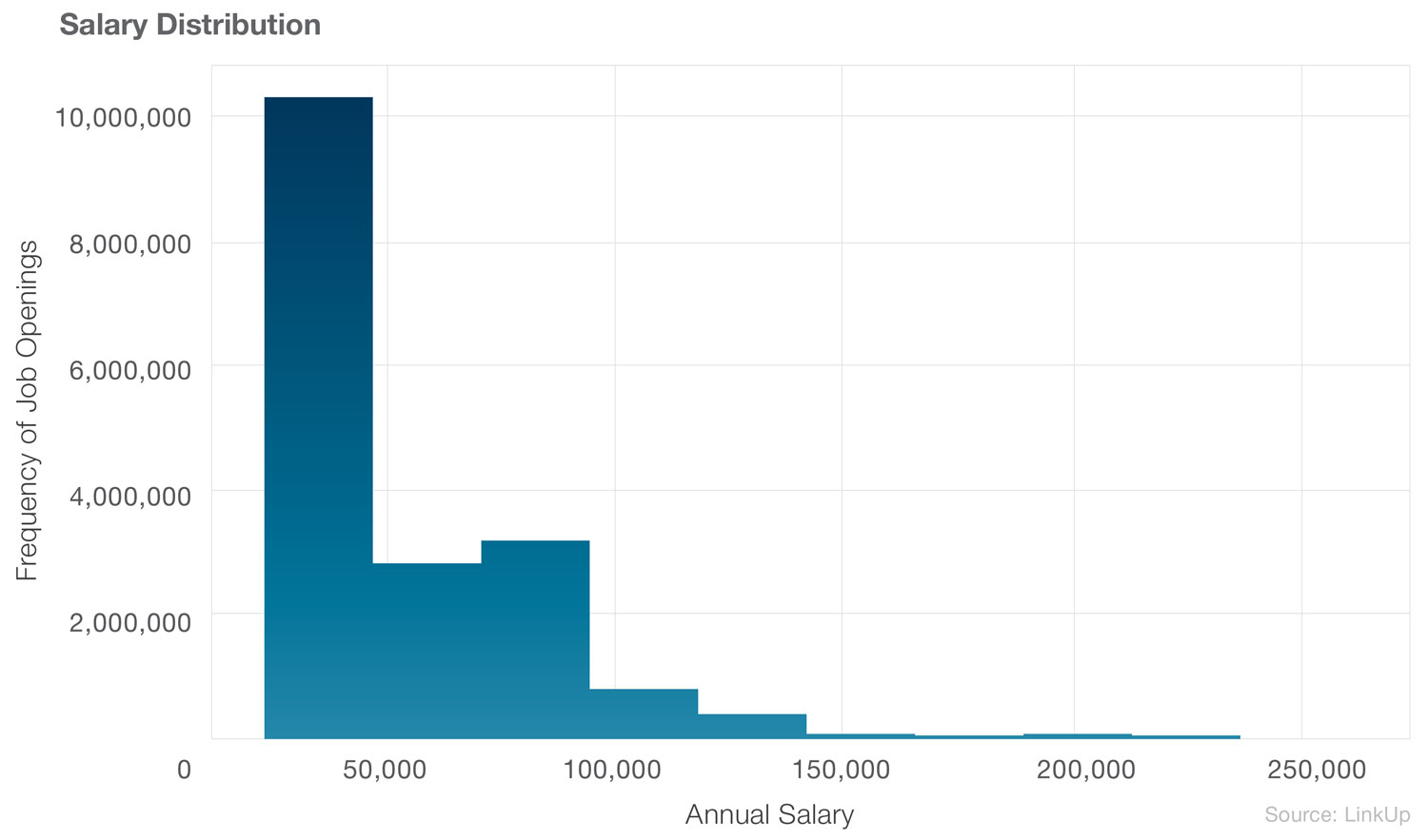
Below is the distribution of salaries associated with each job. We are not surprised to see that higher paying jobs are in smaller supply.
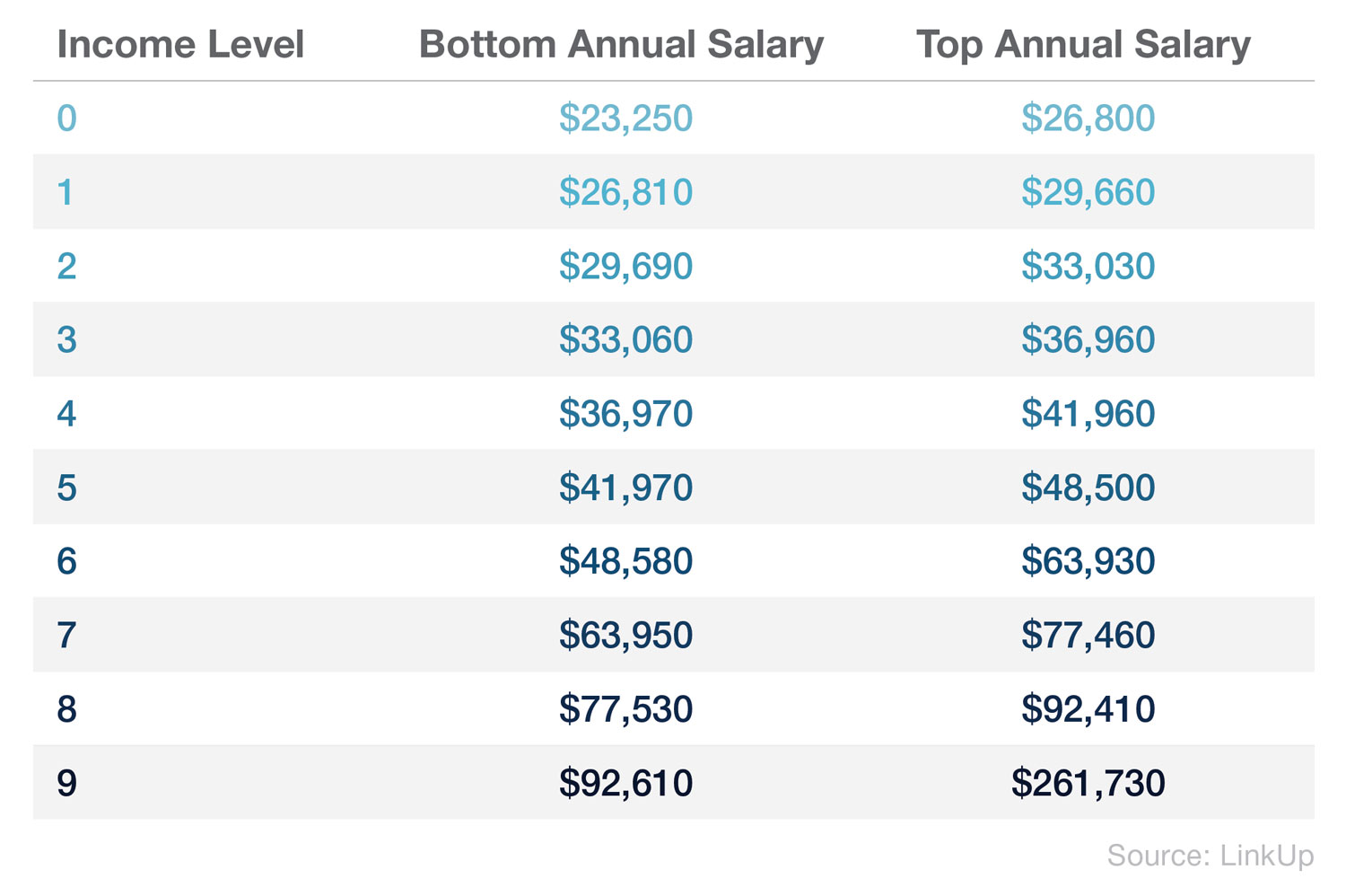
To make more sense of this, we split our listing data set into 10 groups of equal size based on salary information. These can be found in the below table, with the upper bound being 261,730 and lower bound being 23,250.
After dividing these job listings into groups, an interesting pattern starts to emerge. Certainly we start to see the K-pattern become evident.
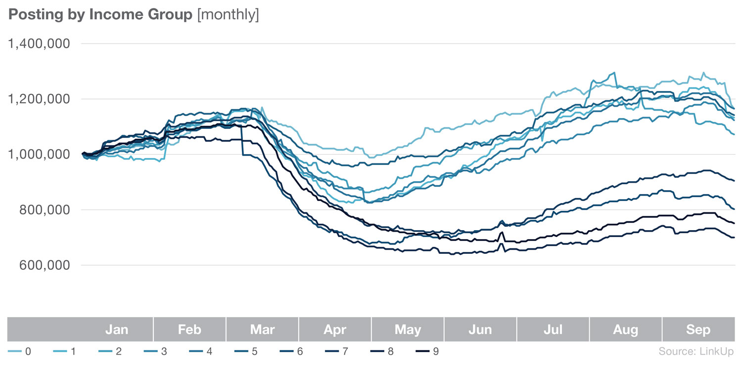
However, unlike other data points, lower salary jobs listings appear to have recovered the quickest. While it’s unfortunate that any group falls short of full recovery, regardless of income level, it is a sign of hope for the economy that the lower salary jobs are returning.
As pointed out in other articles (read more at CNBC and MarketWatch), the recovery has generally favored more well-off households. What our data is currently suggesting is that those lower paying households, while not receiving benefits from a market doing well, can find some benefits in a job market that appears to be favoring them. Additionally, wealthier households are more likely to survive a slower recovery in comparison to less fortunate households.
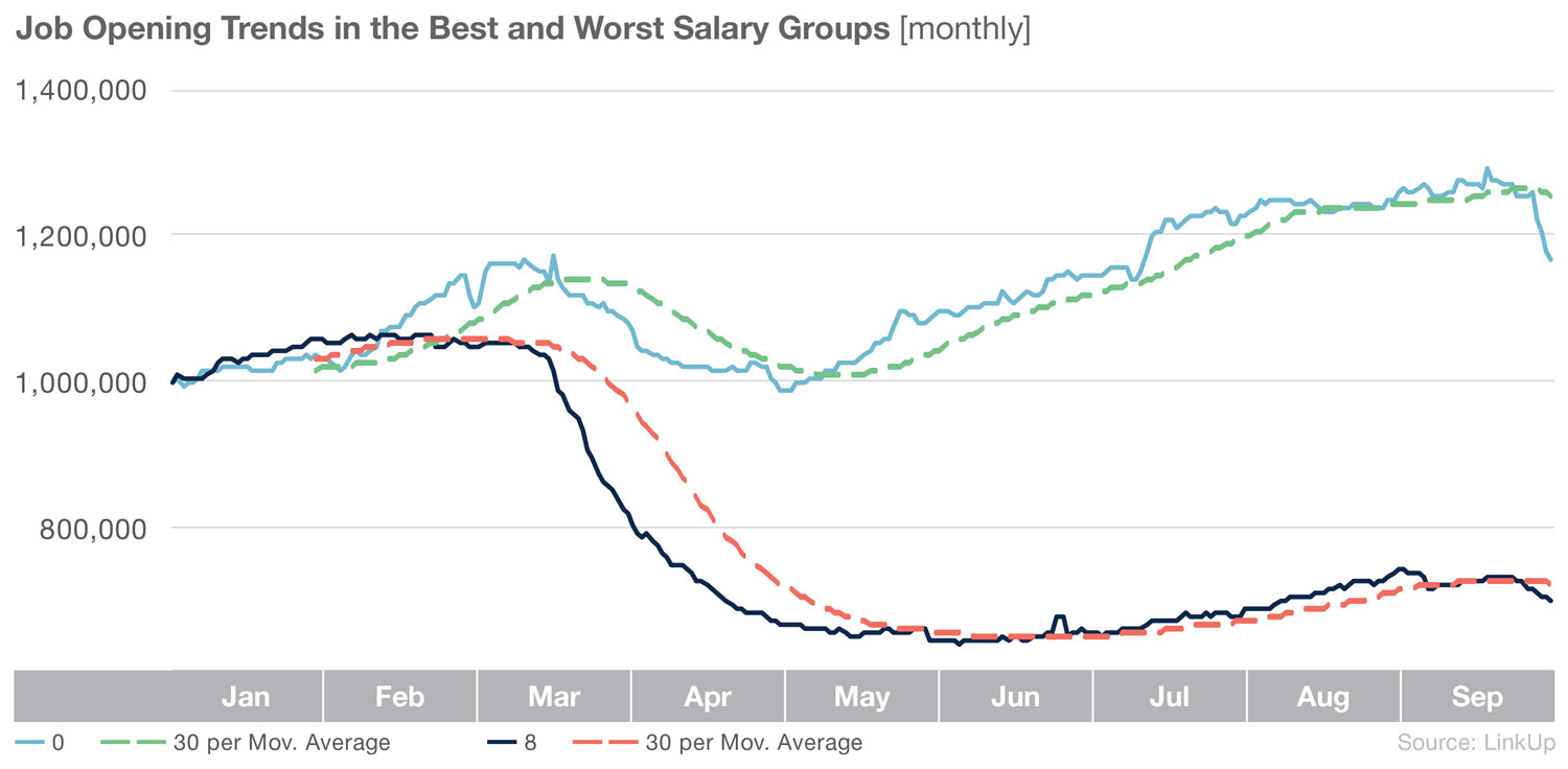
Focusing in on the top and bottom performers and adding moving average trend lines, the K-shape becomes even more clear.
When stacking these groups side by side, we see that the top 40% of salary groups are all still below the level of job listings that were observed at the beginning of the year.
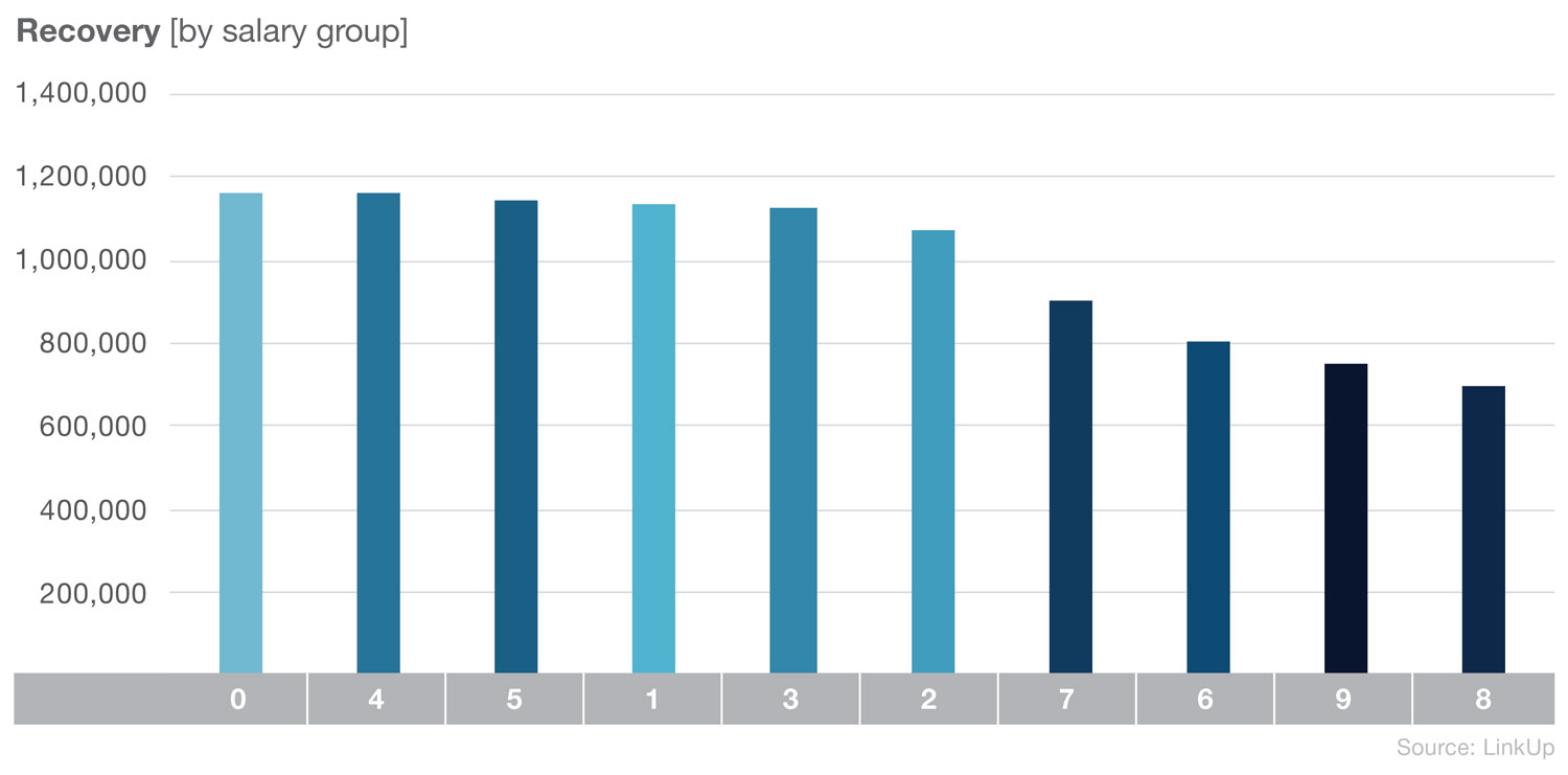
Again, the amount of job loss and job listing loss we have seen in the last year is nothing short of tragic. While some groups are slower to recover, there is hope in the fact that lower and middle class salary jobs listings are back to levels higher than we observed at the beginning of the year.
To learn more about the data behind this article and what LinkUp has to offer, visit https://www.linkup.com/data/.


Sign up to receive our stories in your inbox.
Data is changing the speed of business. Investors, Corporations, and Governments are buying new, differentiated data to gain visibility make better decisions. Don't fall behind. Let us help.


Sign up to receive our stories in your inbox.
Data is changing the speed of business. Investors, Corporations, and Governments are buying new, differentiated data to gain visibility make better decisions. Don't fall behind. Let us help.
