Source: https://www.advan.us/blog.php
Geolocation data gives us an almost infinite number of ways to track and measure the extent and impact of relaxing social distancing measures, such as we are starting to witness in many states across the country.
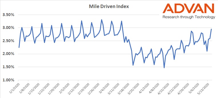
For us – based on our extensive analysis of this kind of data – “miles driven” is a key leading indicator of behavior. Our proprietary miles driven index is an accurate way to track how many miles individuals in the US are driving on a daily basis.
During normal times in the US, the aggregate number of miles driven is typically higher on weekends, as Americans visit friends, go shopping and ferry their kids to sports and other activities.
On March 22, we saw this trend sharply reversed. With the majority of Americans sheltering in place the chart shows a dip, rather than a peak, in miles driven on weekends during March and April. Then, starting the first weekend in May, we see traffic has begun reverting to historic patterns.
The last three weekends have once again seen spikes on Saturdays and Sundays:

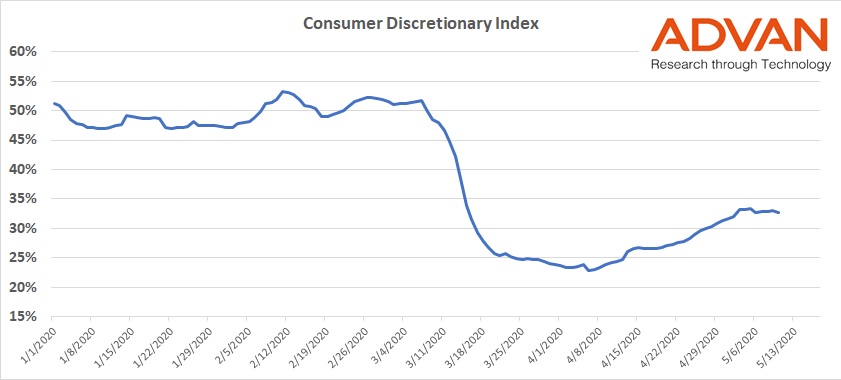
This is a clear indicator that people are leaving their homes more, and traveling further distances. But it doesn’t tell us whether they are getting out of their cars, to shop or use other services. For a more complete picture, we can look at this data alongside foot traffic figures for the consumer discretionary sector.
Our Consumer Discretionary index shows average weekly traffic for this sector was down over 50% in mid-April. Over the last week, however, foot traffic at stores focused on discretionary items was only down 22%. A significant recovery from the low that supports the trend seen in the miles driven data, and indicating that more and more consumers are leaving home and heading back to stores.

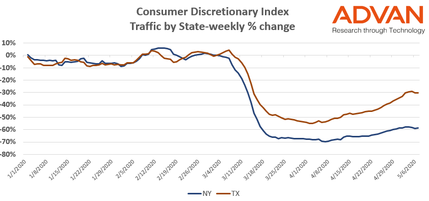
Once again, it’s important to remember that single data point may offer an incomplete picture. While overall in the US, people may be venturing out more frequently and further afield, the story is not necessarily the same in each state.
The chart below shows the stark difference in our Consumer Discretionary index for Texas (red) and New York (blue). In both states we can see traffic ticking up, but in New York the bottom of the U looks like it will be longer and lower than in Texas.

To learn more about the data behind this article and what Advan has to offer, visit https://advanresearch.com/.


Sign up to receive our stories in your inbox.
Data is changing the speed of business. Investors, Corporations, and Governments are buying new, differentiated data to gain visibility make better decisions. Don't fall behind. Let us help.


Sign up to receive our stories in your inbox.
Data is changing the speed of business. Investors, Corporations, and Governments are buying new, differentiated data to gain visibility make better decisions. Don't fall behind. Let us help.


